Tuesday, December 7, 2010

Lab 8 Final Lab: Mapping the Census

For this lab, I have constructed three different population images from data taken from the US 2000 Census data. From this we can see where we have come since the year 2000 with respect to the three populations; Asian, Black, and Other Race.

Please look below to see the figures of each race. Figure 1 displays Asian population distribution, figure 2 shows Black population distribution, and figure 3 illustrates the other race population distribution that are present in the US. Figure 4 gives a representation of how the US is divided into different sections for the distribution of the US Census. Figures one, two, and three were created using Arc Gis, Arc Catalog, and by following the pdf tutorials presented by Professor Shin and through the help of my TA Patrick Khan at UCLA.

Figure 1: Asian Populations

This map displays the Asian population in the United States. When the Asian immigrants arrived to the United States, among the first were the Chinese (Johnson, 2007). Around the 19th century, Asian immigrants were excluded from obtaining citizenship. This greatly hindered their ability to participate in society (Johnson, 2007). Before WWII Asians like the Japanese were forced into the concentration camps. This was very unfair treatment, but as paranoia spread throughout the country about anti-democracy interest, the United States took unfair measures against the Japanese. Following World War II, the not being able to obtain citizenship law was repealed so that more Asians could get into the United States at an easier rate (Johnson, 2007). After much of their strive, Asians have assimilated rather well in the United States. According to C.N. Le, Asians are stereotyped as being all the same (C. N., 2010). This is definitely not the case because Le shows a chart that represents all of the races within the larger denomination of Asian. These include Chinese, Filipino, Asian Indian, Korean, Vietnamese, and Japanese. These values are from highest to lowest respectively (C. N., 2010). As one can see, there are many different types of Asian Americans. Many of which are present on the east, west, and northwestern parts of the U.S. They are especially present in southern California. Asians account for a large amount of the U.S. population and at universities such as UCLA they are almost seen as the majority. 


Figure 2: Black Population
The black population in the US is very important to the US census. It has become controversial that the US government did not care about the black population when music artist Kanye West said "George Bush does not care about black people" (Tucker, 2010). He said this in response to George Bush's poor planning and lack of a plan of action to aid the people of Hurricane Katrina. The US census plays a role in situations like these. Money that is appropriated by the Census is given to departments that oversee public safety among other things. As one can see from figure 2, the black population is mostly concentrated in the deep south and on the east coast of the United States. The connection between slavery and black presence in the US can be mentioned to account for the presence in the south and east coast, but there are other factors that lead to the south and eastern concentrations. Black populations have lower incomes than Asian and White Americans and live in different areas where education, income, and healthcare services are low. There is a growing concern that they need to be represented in the allocation of funding. The first step to making this happen, is to incorporate more blacks in the US census. People are hired to go around to make sure that each household turns in their form. A lot of money goes into making sure this happens (for example when the Census was taking place, the government was paying Census employees $18 an hour, with little to no work experience).

Figure 3: Other Races
The US has often been called the melting pot because of its cultural and ethnic diversity. According to figure 3, much of the other race is present in the Midwest and west coast of the United States. This can be accounted to the immigrants who are coming from Mexico. According to Professor Fan who taught Population Geography this quarter at UCLA, Mexico is the country with the largest amount of people emigrating out, while the United States is the country with the largest amount of immigrants from Mexico. Other races account for non black, or Asian. The reason for most of the other races being towards the midwest and the west coast is because of the dispersion of people. According to Professor Fan at UCLA people tend to migrate because of economical reasons. People are in search of work, so much of the highest concentration of other races are located in cities that offer jobs.

Figure 4: The Divisions of the US Census Bureau

Discussion

The US Census is a data collection of the entire nation that is taken once every 10 years. One can see that the US census is vital to the American people. The US Census is conducted, regardless if there are internal and external conflicts, or changes in the nation's interests, or revolutionary events (The U.S. Census Bureau, 2010)The data shows how the US population is growing and how the priorities and interests of its citizens changes. It is very useful to the economy and helps the government allocate funds according to the representation of each area, race, department, etc. This is why it is very important that every possible person should fill it out. Of course there are people who are reluctant to do so, for fear of being deported (like illegal immigrants), for being too lazy, and for not being able to read and understand it, among other reasons. For example, by getting census information from illegal immigrants, the government would be able to appropriate funds to Latino communities if they were represented as an area that required funding.

Conclusion

My overall impression of GIS has ended on a good note. I had previously done work under Kris Kaiser in the Life Sciences Department and explored the species distributions of frogs in Belize. Although I had to stop my research because of time commitments, I owe a lot to her and what she has taught me. Now in taking this GIS class, I have learned the details behind the process and how maps are created instead of just following and memorizing a series of steps to create a map. I know what models to use for different situations and how important it is for a map to be on the same scale as the data. Throughout the quarter we have learned to work on labs from Beverly Hills, to neogeography, to investigating the pitfalls of GIS, to the station fire, to projections, to digital elevation models, and finally lab 8, which is mapping the US census among different races. 

There are many pitfalls to GIS, as explored in lab 4, but at the same time it is immensely useful. We are able to do an endless amount of calculations with GIS such as, map out species distributions like I had done in my research in order to predict which species will be at risk of extinction, or we can map out traffic in the LA area to find ways to reduce the influx of vehicles at certain times of the day, and many other things. Just as TA Patrick Khan said, "I have worked with GIS for many years and it still surprises me how much I still do not know about it." GIS is a learning process the entire way through. I hope to work with GIS in the future after I graduate UCLA with my Geography and Environmental Studies degree. The growing need for conservation in the world we live in today has much need for GIS.

Bibliography


C. N., L. (2010). Population Statistics. Retrieved 12 7, 2010, from Asian-Nation: http://www.asian-nation.org/population.shtml

Energy Information Administration. (2000, June 14). Regional Energy Profiles: U.S. Census regions and divisions. Retrieved 12 7, 2010, from Energy Information Administration: http://www.eia.doe.gov/emeu/reps/maps/us_census_files/cendivco.gif


Fan, C. C. (2010). Population Geography. Retrieved from lecture notes.

Johnson, D. (2007). Asian-American History. Retrieved 12 7, 2010, from Info please: http://www.infoplease.com/spot/immigration1.html

The U.S. Census Bureau. (2010, October 5). History. Retrieved 12 7, 2010, from U.S. Census Bureau: http://www.census.gov/history/www/through_the_decades/fast_facts/

Tucker, K. (2010). George Bush really does not 'appreciate' Kanye West's Katrina criticism: 'The worst moment of my presidency'. Retrieved 12 7, 2010, from Entertainment Weekly : http://watching-tv.ew.com/2010/11/02/george-bush-kanye-west-lauer-today/


Tuesday, November 23, 2010

Lab 7 Fire and Air Quality

For this lab, I wanted to explore the air quality of LA county and its relation to the station fire. According to the InciWeb site, the station fire took place in 2009 and was officially contained on October 16th. The station fire was the 10th largest fire in California since 1933. The Station fire has claimed the lives of two firefighters and injured 22 people. The report stated that the fire was contained following rainfall in the San Gabriel Mountains in the earlier week. Along with the rainfall, fire fighters were able to contain the remainder area of the fire in the San Gabriel Wilderness Area. 


Since so much was burned, consistent rainfall and moisture will greatly reduce chances of wildfires in the near future for the San Gabriel Wilderness Area. I wanted to show the moisture in the LA county area, so I decided to add LA County data with water presence. Since the viewer cannot blow up the size of the image, it is a bit difficult to fully see every portion of water; regardless this map offers an interesting perspective. Although there is adequate water coming into the the LA county (Much of this water is taken from aqueducts from the northwestern and Midwestern United States), this still not fully stop wildfires from taking place in southern California's chaparral. Water has a role to play with air quality. Since LA county pollutes so much that when the water evaporates, some of it becomes acid rain. 


Something to consider about wildfires is that they are natural and need to take place in order for the environment to go through the necessary steps of regrowth. Wildfires inherently cause smoke which is not healthy to the environment and the organisms that inhabit it. The air quality of LA is known for being very unhealthy. According to the South Coast Air Quality Management District, the air quality for Orange County increased from 15 to 20% from 2002 to 2003.  The Daily News of Los Angeles states that even though there have been improvements, the Los Angeles area holds its place as the most ozone-polluted area in the US. This statement was given by the American Lung Association in April 2009.

The Huffington Post stated that six in 10 Americans, which is approximately 175 million Americans. Los Angeles county has a high percentage of the nation's population. Though this is due to being such an industrial city, some of it is due to fires. Air quality is an important issue that needs to be addressed because it affects our health and can lead to lung diseases which shorten life expectancy. Since they are natural, it is beneficial to take part in controlled burning, which helps the environment as well as limits the amount of air pollution. The reason the station fire was so hazardous was that it covered such a large area and that dry debris had been piling up so that when the fire started it spread very fast.


As one can see, the majority of people who live in the LA county live before the San Gabriel Mountains. The wind patterns allowed the smoke from the station fire to carry throughout the county. It greatly increased air pollution at that time. In my personal experience, the news informed many not to exercise around this time because it was harmful to one's lungs. Fires like the Station Fire could have been avoided. It was not a natural fire, but the authorities were unable to find the culprit. Controlled natural fires that are reoccurring are the most beneficial for the environment. The LA county has to understand that its location involves natural fires, so measures need to be implemented to prepare for those situations. Sometimes mistakes happen and the community has to be prepared to live with those affects.

Work Cited

Images


Tuesday, November 16, 2010

Lab 6: Digital Elevation Models [Aspen, Colorado]

Aspen, Colorado


The area I have chosen to do my digital elevation model is Aspen, Colorado. "A place where the beer flows like wine. Where beautiful women instinctively flock like the salmon of Capistrano..." I chose this area because when I was a child I wondered how the characters Harry and Llyod (from the movie Dumb and Dumber 1994) dove a small moped motorcycle all the way to Aspen successfully. There had to been way too many inclines and mountains for that little moped to handle. On a serious note, I went to Aspen recently on a Fraternity ski trip and had a really great time playing cards, eating, and snowboarding. The mountains are so amazing and I thought it would be interesting to display this area in digital model. This type of information would be useful for many different purposes. One that relates to why I chose this area relates to contractors who are looking to construct a new ski resort on another mountain near Aspen. On a biological scale this type of information is important in mapping types of vegetation and species because elevation has a huge impact on the species diversity and range. 


The following information describes the area, the extent information, and the geographic coordinate system.


Extent
Top: 39.7522222217degrees
left: -107.004166666 degrees
right: -106.474999999 degrees
bottom: 39.2777777772 degrees
Spatial Reference: GCS_North_American_1983
Datum: D_North_American_1983


Hillshade
Although there are other visuals that have been modeled from this data, the hillshade is the most visually appealing. It's glossy finish and color chart really allows one to see how the elevation is from a bird's eye view.

Slope
Three-dimensional
This view one to put the elevation on the two-dimensional scale and see the spikes of elevation.

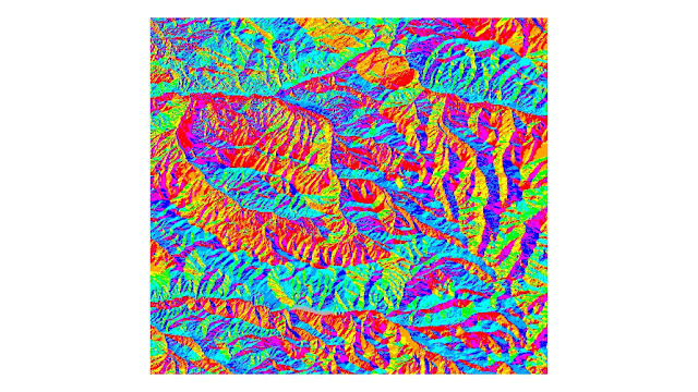
Aspect
The aspect ratio allows one to see the elevation changes at different angles.

For all you Dumb & Dumber Fans
Follow this to see their amazing feat on a moped.
http://www.youtube.com/watch?v=yKRtdgQhVbw


I stayed at Hotel Jerome when I went to Aspen. If you would like to check it out, take a look!
http://www.youtube.com/watch?v=3ScpbPC_vLU


Monday, November 8, 2010

Lab 5: Projections

The following images are represented in Equal Area, Equidistant, and Conformal projections. I have given two examples of each type of projection along with labeling the two cities Washington, D.C. and Kabul, the distance between, and I have given some comments regarding the projections toward the bottom.

Equal Area

Equidistant

Conformal

Map projections allow us to view the earth in many ways. Since the earth is a three dimensional shape it makes converting it to a computer or drawing slightly difficult. The easiest way of displaying this data is to put it into a two dimensional surface or shape. This is very useful because it provides different perspectives of the same data, which could lead to many different conclusions. There are positives and negatives towards map projections. As a result of not being able to easily represent the earth fully in a three-dimensional shape, each compares different variables and unfortunately distorts distance, shape, or area (however, many researchers have agreed on the Mercator projection showing the best results).

In map projections that distort area, such as sinusoidal projects, the area of the map north to south and east to west has the same area. When compared to the conventional two-dimensional map, the area is adversely different. The sinusoidal projection allows the grid to be equal area so, if one were to look at Greenland, it seems as if it is as long as North America. The cylindrical equal area projection takes the two-dimensional map and wraps it around a theoretical cylinder. This is helpful when the projection is concerned with the middle near the equator but towards the north and south, the projection follows the cylinder rather than a sphere. This map projection is very close to what the projection would be like on a simple two-dimensional plane. The distortion of area is something that needs to be noted otherwise it can cause one's conclusions to become inaccurate if this is not taken into account.

This is similar to equidistant projections because in those projections the distance is not changed but the area and shape is distorted. This is an interesting way to look at the earth, but one must not overlook that the measurements between two points are not the same distance. The equidistant conic projections offers an interesting outlook of the earth. In this projection the earth is viewed from the northern or southern pole and then squashed onto a two-dimensional surface. The equidistant cylindrical projection shows the earth represented by a two dimensional shape in the form of a cylinder, but unlike the cylindrical equal area projection, it also preserves distance. Since these map projections have equal area, it changes the 'actual' area of the real land mass.

In conformal projections like Mercator projections keep angles preserved while distorting shape and area. This is one of the most used projections because it can represent lines constantly as straight line segments. It maintains angles, Greenland again is displayed with having more land mass than South America. The gall stereographic projection does not preserve distances or area. This type of projection takes the spherical world and projects it onto a circular plane. There is much potential, but at the same time many perils when comparing and analyzing the accuracy and significance of map projections, but the only way to fully visualize the world is to see it through all types of map projections. If one were to over look variables that are not maintained in certain map projections, then results could turn for the worst. One has to exercise utmost caution and question the validity and accuracy of a projection when working with them.


Monday, November 1, 2010

Lab 4: Potential and Pitfalls of GIS

Example Proposed Airport Expansion
By Tej Singh

GIS is always changing the way we view, interact, and share our world with each other. Global information systems have many different purposes, which include but are not limited to: transportation, population, politics, wildlife, environmental degradation, weather, architectural planning, and much more. This lab walked the user through a tutorial about a proposal for an airport expansion. It looked up noise pollution, population density, land use, and proximity to schools. Variables like noise, population, land use, and proximity to schools play a part in a community deciding whether to approve this proposal. If this expansion would hinder students from paying attention and learning in school because of the noise, then it would likely not be passed. Population plays a role by accessing whether the community will actually require an airport to prosper. Lastly if the land is not occupied by human influence, the environmental factor would also affect the chances of this approvals success. Variables are analyzed in GIS to figure out an beneficial solution to a problem. 

Some potentials of GIS include the ability to predict future events based on past and current data. For example if a contractor wanted to know whether or not it would be profitable to build a housing complex or neighborhood in a certain area, he would be able to look up data records for population, climate, birth rates, death rates, proximity to schools, etc and put them all on different layers in a GIS raster grid. By using variables like these, an educated guess could be made by the data. 

Although GIS allows us to explore the world and increase our understanding, there pitfalls to GIS. 
The biggest pitfall of GIS is the need for precise and accurate information or data. If the data that is provided is excluded, or inaccurate then it does produce a good projection. It has been stated that when one puts garbage in, he or she will get garbage out. I realized this while I was working on this lab because, there were so much room for error if I did not review the tutorial pdf while I was working with ArcMap. Since GIS is so professional, it cannot be easily understood by the general public without some understanding of the program. This makes it hard for the average person to use GIS to explore and analyze the many variables that it is capable of working with. Neogeographical programs like google earth, yahoo maps, google maps, etc. are better suited for the public, while GIS like ArcMap and other programs are used by researchers and students. 

For a very long time, GIS was only in the hands of the government. This type of access to such information was held very high because of fear of it falling into the hands of an enemy or someone who could exploit the information for personal gain. It was only until recently that it was released in to GPS so that one could more easily navigate around world. Now most people won't travel anywhere without already looking it up on map quest, google maps, yahoo maps, or other types of programs. One pitfall with this (that some people would not see as relevant or interesting, but I would like to point out), is that the romanticism of the world has been lost. Not long ago people would take road trips across the planet so that they experience an unexplored part of the world. Now one is able to look up almost anything such as restaurants, airports, universities, companies, hotels, and other things, which makes the world a smaller place. GIS helps us understand what we already know and helps us see what could result from it. Since technology is moving forward, advances in GIS has more potential than pitfalls as of right now.

Tuesday, October 19, 2010

Lab 3: Neogeography

Turner (2006) defined neogeography as “…people using and creating their own maps, on their own terms and by combining elements of an existing tool set." Here I have created a map that draws from my own interests and shared it with others. When I was in high school, my friends and I liked going to the beach because I am from Santa Barbara. This was especially the case in the summer time, but since the weather was relatively constant year round, going to the beach was not uncommon. Whether we went to the beach to play football, volleyball, Frisbee, to skim board, surf, boogie board, or just to go and hang out, we would always get hungry when we were leaving. Since we liked to keep things cheap, we would go to a fast food restaurant to curb our appetite. Burgers were always a favorite. Nothing like greasy American food to fill you up after the being at the beach. My personal favorite was and is Jack in the Box. This is because Jack in the Box has so many chicken options. Many argue otherwise, but I do not eat beef or pork so my loyalty to fast food burger places lies with Jack in the Box. Since then, I have preferred a little higher quality burger places like Fatburger, but I always stop by Jack in the Box every now and then.

Commentary:
I would like to take a moment to point out the pros and cons of my map. Although it is an interesting way for the University of California campus community to view the different routes to the various beaches, there are some factors one should consider. The locations for the starting points were chosen arbitrarily (wherever Google had the name of the campus displayed, was where the starting point was made). Also the the beaches that were chosen as ending points were chosen by personal preference and do not reflect the only route that could be taken to get to a beach. 

These are the pitfalls of neogeography. Since this map is made using my terms, my experience, and my preference, it mostly applies to me before it can apply to the average student. There is a lot of potential as well to neogeographic maps. It can serve as a comparison to how we interpret the world around us in relation to another person.The purpose of my map is to provide a brief map of optional routes to take when considering going to the beach and grabbing a bite to eat along the way. It was tradition for me and my friends so I hope I can pass the knowledge on. Some things that I would have done differently if I were to do this again would be, to survey students on each UC campus where their favorite beach and fast food place was and map out those routes and locations. Unfortunately I do not have the time or resources to accomplish this task. Fortunately Google is available to everyone with an Internet connection, so hopefully people will be able to use this as a reference in making their own decision on planning their beach trip. 


Follow the link to view my map and videos about the various beaches!

Sunday, October 10, 2010

Lab 2: Analyzing the 7.5 Minute Map

1. What is the name of the quadrangle?
This quadrangle is called the BEVERLY HILLS QUADRANGLE, CALIFORNIA-LOS ANGELES CO. 7.5 MINUTE SERIES (TOPOGRAPHIC)


2. What are the names of the adjacent quadrangles?
The names of the adjacent quadrangles are Canoga Park, Van Nuys, Burbank, Topanga, Hollywood, Venice, and Inglewood.


3. When was the quadrangle first created?
This quadrangle was compiled in 1966, the imagery in 1978, and inspected in 1995.


4. What datum was used to create your map?
The National Geodetic Vertical Datum of 1929 was used to create this map. There are also datum from the North American Datum of 1927 and 1983.


5. What is the scale of the map?
The Scale of this map is 1:24,000


6. At the above scale, answer the following:
a) 5 centimeters on the map is equivalent to how many meters on the ground?
[(5centimeters on map)x(24000centimeters on ground)]/[100meters on ground] = 1200 meters on ground


b) 5 inches on the map is equivalent to how many miles on the ground?
[(5 inches on the map)x(24000 inches on the ground)]/[(12 inches per foot) (5280 feet in a mile)] = 1.8939 miles


c) one mile on the ground is equivalent to how many inches on the map?
[1 mile on the ground]/[(24000 miles on map)(5280 feet per mile)(2.54 inches per foot)] = 3.319 x 10^8


d) three kilometers on the ground is equivalent to how many centimeters on the map?
[(3km on the ground)/(3x24000 km on the map)(1000 meters in a km)(100 cm in 1 meter)] = 4.166 x 10^-10 centimeters on the map


7. What is the contour interval on your map?
The contour interval of this map is 20 feet.


8. What are the approximate geographic coordinates in both degrees/minutes/seconds and decimal degrees of:
a) the Public Affairs Building;
http://www.spa.ucla.edu/media/news_images/NewBldgNameWeb07.jpg


[34° 4' 1.5258", -118° 26' 50.8726"] or [34.067°, -118.447°]
b) the tip of Santa Monica pier;


http://home.comcast.net/~bygonebyways/66CA-Santa_Monica-Pier_Bench.jpg
[34° 0' 26.7978", -118° 29' 59.6394"] or [34.007°, -118.499°]


c) the Upper Franklin Canyon Reservoir;


http://www.lamountains.com/enlarged_images/franklin1_enlrg.jpg
[34° 7' 12.5538", -118° 24' 37.08"] or [34.120°, -118.410°]


9. What is the approximate elevation in both feet and meters of:
a) Greystone Mansion (in Greystone Park);
580 feet, 176.78 meters
    690ft, 210.312m


http://www.diglounge.net/wp-content/uploads/2008/06/greystone.jpg
[34° 5' 31.8156", -118° 24' 5.0394"] or [34.092°, -118.401°]


b) Woodlawn Cemetery;
140 feet, 42.672 meters
http://www.thewoodlawncemetery.org/film.html
[34° 1' 5.963", -118° 28' 41.959"] or [34.018°, -118.478°]


c) Crestwood Hills Park;
690 feet, 210.312 meters
http://www.travelinlocal.com/wp-content/uploads/2009/10/tl10-10.jpg
[34° 4' 38.5644", -118° 29' 17.34"] or [34.077°, -118.488°]


10. What is the UTM zone of the map?
The UTM zone of the map is Zone 11.


11. What are the UTM coordinates for the lower left corner of your map?
3763000N and 3615000E


12. How many square meters are contained within each cell (square) of the UTM gridlines?
1,000,000 sq meters


13. Obtain elevation measurements, from west to east along the UTM northing 3771000, where the eastings of the
UTM grid intersect the northing. Create an elevation profile using these measurements in Excel (hint: create a line
chart). Figure out how to label the elevation values to the two measurements on campus. Insert your elevation
profile


Points 5 and 6 represent 500 and 460 respectively (the points that encompass the UCLA campus)


14. What is the magnetic declination of the map?
The magnetic declination of the map is 14 degrees East.


15. In which direction does water flow in the intermittent stream between the 405 freeway and Stone Canyon
Reservoir?
The water flows from the north to south in the intermittent stream between the 405 freeway and the Stone Canyon Reservoir.


16. Crop out (i.e., cut and paste) UCLA from the map and include it as a graphic on your blog.